Exploratory Data Analysis
Our early work on p301 has resulted in a data explorer
application, p301dx, that is designed to help scientists
study large and often disparate datasets. Currently, the
application allows scientists to explore various collections
of climate and ice-core datasets. The tool is highly
responsive and allows users to re-sample and display
large datasets very quickly. The graphs that are created
can then be exported as high-quality vector images in
SVG, EPS, and PDF formats, as well as bitmapped
images in PNG format.
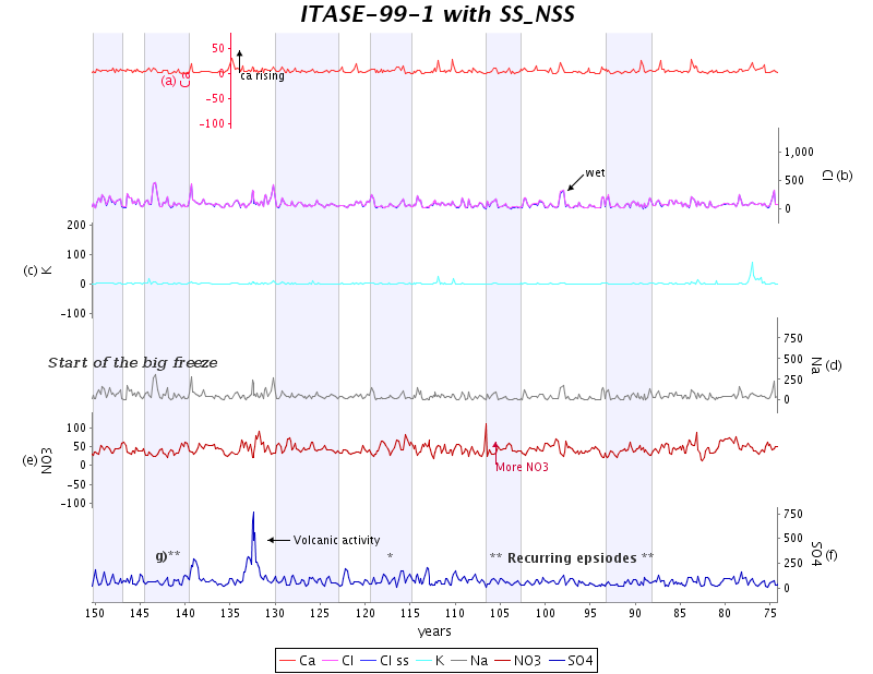
A screenshot of a typical p301dx session appears as
Figure 1. The chart in this session has been built by
processing and plotting data from the Siple Dome core,
with additional markers corresponding to notable dates
extracted from the PDF version of a research paper [2].
When one of these markers is selected, the relevant text
from the paper is displayed.
| Figure 1: | A screenshot of a p301dx session. (Click on the image for a larger version.) |
|
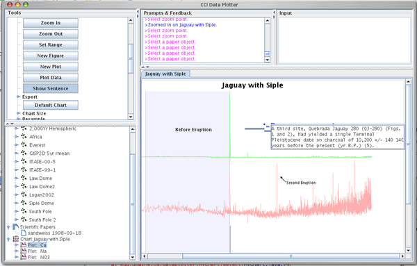
Interface
As suggested by Figure 1, the graphical interface is
composed of five panels. The largest panel displays the
charts and other graphical products resulting from data
manipulation operations. The two small panels above
the chart panel are used by the system to provide
feedback and to solicit input. The two panels on
the left are the most interesting ones. The upper
one is a dynamic palette of functional tools: Each
tool is a function that takes one or more objects as
arguments and produces one or more objects as
output. Input data objects are drawn from the working
objects panel in the bottom right corner, and the
resulting data objects are deposited there as well. Many
tools, such as those that expand objects or smooth
time-series data, take one or more data objects as
their functional arguments. However, tools are also
permitted to use other tools as arguments. As a simpleexample, a composition tool takes two tools, T1 and
T2 as arguments and produces a new tool, T3, the
composition of T1 and T2, that is deposited in the tool
palette.
Charts
An important feature of p301dx is its ability to
produce the kind of detailed, carefully formatted and
annotated charts customarily used in climate-change
research. To this end, the system provides the expected
interactive tools for manipulating chart components such
as markers, labels, scales, and colors. Further, all charts
can be exported in both vector and raster formats, to
enable easy processing by other tools. Figure 2 depicts a
simple example of such a chart, the unedited output of
p301dx.
| Figure 2: | Sample output. (Click on the image for a larger version.) The output is rasterized for Web display.See also the vector PDF version. |
|
Additional examples and screenshots appear in the next section.